fitz posted: " Fig. 33.1. Good watercolours send a clear message to the prospect that we have "a creative" in charge here. That's a good thing. The following is excerpted from "The Intelligent Hand," by David Binnington Savage – a peek into a woodworking life that's" Lost Art Press
Fig. 33.1. Good watercolours send a clear message to the prospect that we have "a creative" in charge here. That's a good thing.
The following is excerpted from "The Intelligent Hand," by David Binnington Savage – a peek into a woodworking life that's at a level that most of us can barely imagine. The customers are wealthy and eccentric. The designs have to leap off the page. And the craftsmanship has to be utterly, utterly flawless.
How does one get to this point? And how do you stay there?
One answer to these questions is in this book. Yes, the furniture can be technically difficult to make. But a lot of the hard labor involves some unexpected skills. Listening. Seeing. Drawing. And looking into the mirror and practicing the expression: "And that will cost 20,000 pounds."
If I were learning to create presentation drawings now, I would probably not be learning analogue skills, but instead go straight to computer-aided design (CAD). A good-quality program that will link properly to a computer-aided manufacture (CAM) program would be the tool here – not a cheap 2D version, but one that will show you the job, turning it around to show it from all angles. I am reliably told that a good two years should see you fluent in CAD. We teach the possibilities of CAD at Rowden, using Rhino, but getting fluent takes time; it's a complex program.
However this is for Lost Art Press – and doing decent watercolour presentation drawings is getting to be archaic. This is a shame, as good watercolours send a clear message to the prospect that we have "a creative" in charge here. That's a good thing.
Have a look at nearby printing facilities. Heavy watercolour paper is like thin card stock – it's so thick. If you can find a printer to accept this thick paper, you can print from CAD using a fine grey outline that can be gone over with pencil and watercolour to a similar effect.
I wrote earlier about the tools and what you are attempting to achieve. Now I will be specific about how these drawings came about.
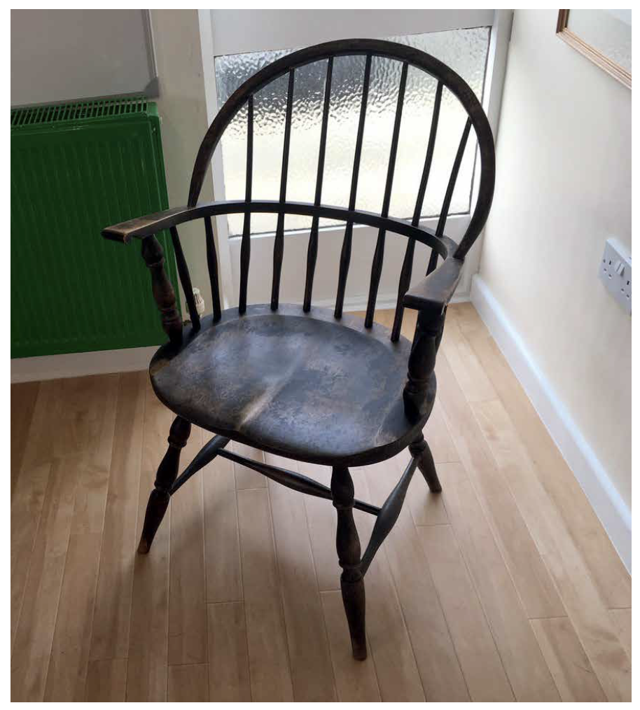
Fig. 33.2. An old American-made Windsor chair in the studio that I keep as a chair totem. I look at it and take measurements from it when questions come up.
First the chair. I had the sketches; I would never go straight to watercolour without a sketch to work from. I want to improve upon it here, while sticking with what I've downloaded [the idea from his mind] to keep the proportions and the idea nice and clear.
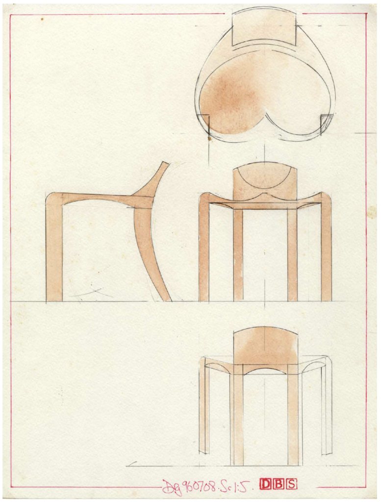
The side elevation was first; this was a matter of choosing a scale to draw with. I knew my paper was going to be in landscape orientation, as I want the side elevation with the front elevation alongside so I could transfer dimensions from the first drawing to the second. If need be, I work a plan drawing in there some-where. The layout of the page is critical. So, I chose a scale of 1:5 to nicely fill the page.
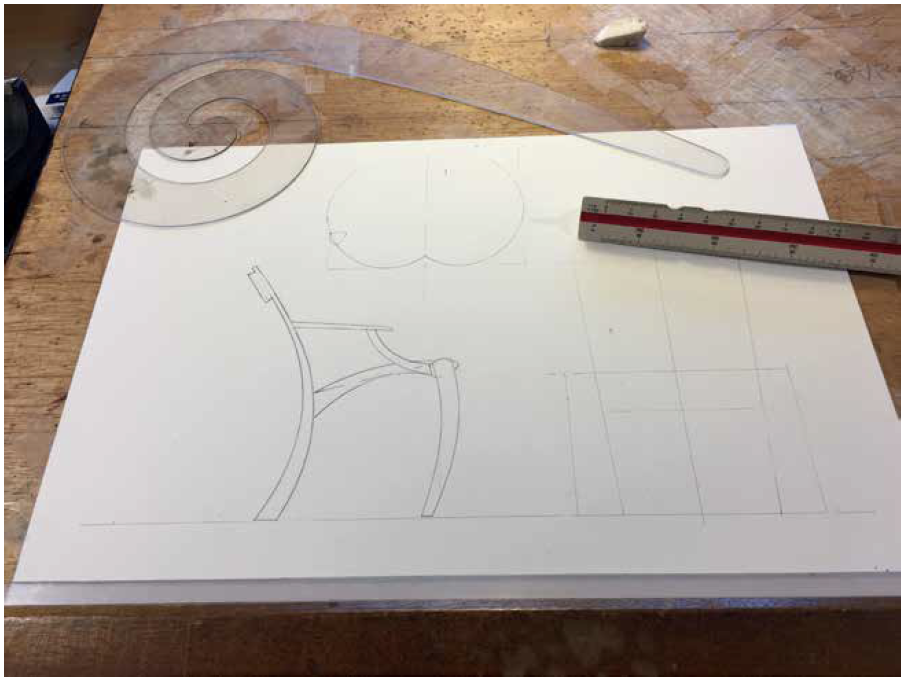
I use what is called a scale rule – a triangular cross-sectional rule with several scales; 1:10, 1:7.5 and 1:5 are the three I use most. The paper is A3 (11.7" x 16.5") 140 lb. watercolour hot-pressed paper – really heavy and super smooth. I fix it to my cedar double-elephant-sized drawing board on the left in the bottom quarter, fixing on all four corners with translucent drafting tape. Over the years a mound of this tape has built up in this section of the board – a witness to the hundreds of drawings I've done on it.
I put the paper on the left to be near the ebony edge of the cedar board on which the T-square slides. I got rid of parallel motions and clever architects' drawing aids years ago in an effort to have only simple tools that would always be accurate if I held them correctly.
Double elephant – huh?! Well, yes – it's not a mea-sure often heard now, but it was a size of paper when paper was not measured in A-whatever or inches. In the old days we had elephants as a way to measure the size of a sheet of paper. This is the biggest drawing board I could find; it's about 42" x 31". You need a big drawing board and a block of wood to support it at an angle on your bench. It's got to be big to do perspective drawings – but that's for later.
The first line on the page is the floor. I look at how large the chair might be, how high and how wide, then work out where the side elevation should sit on the paper at 1:5. A line for the height of the seat goes in next; here, it's 14-1/2"; if the seat is to compress when you sit on it, I put this line slightly below the top of the seat.
Fig. 33.3. I'm working on the plan view of the seat.
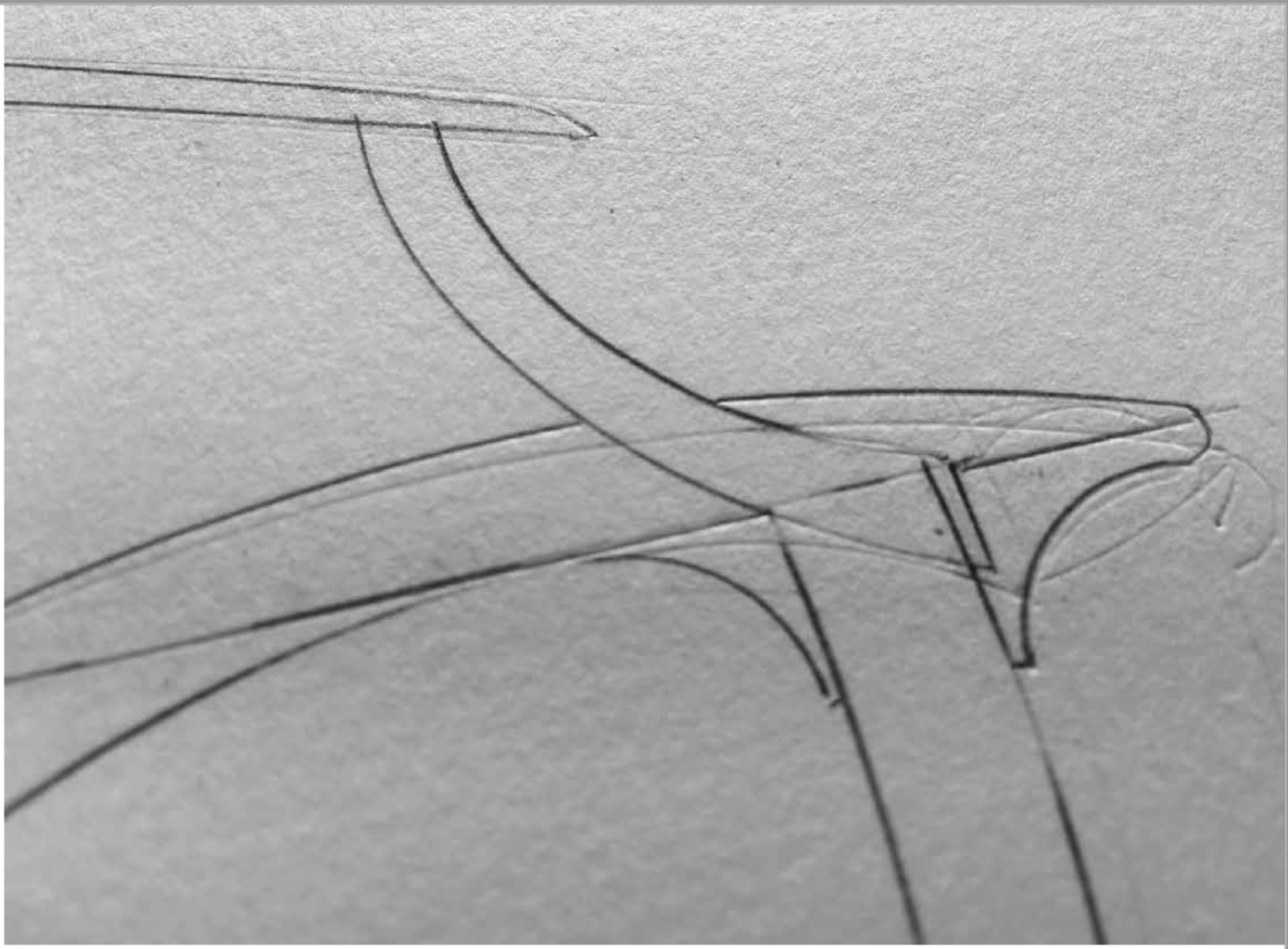
Now I put two lines down for the back leg and the seat. I look hard at the sketch and how that seat slopes and how the back leg leans way back. Here, I use one of my two big French curves mentioned earlier, the one that is a big spiral, with the radius opening out as you go around it. I used this tool repeatedly on this drawing, as I wanted a family of shapes that would have the same feel, the same DNA.
I do this a lot on chairs when I've designed a curved back leg shape – using the curves to develop the front leg and arms, while trying at the same time to use it differently to create different shapes with the same origin.
Having put down the side elevation to the best of my ability, I think about the front elevation and the plan. Chairs are very three-dimensional; they have to look good from all around. This means thinking in three dimensions, accepting that this side elevation has a consequence on the front and plan elevation. You find yourself chasing around the image. Top. Bottom. Side. Side. Top. Bottom. It's a subtle form of madness.
Bang in the first lines for the front elevation – the baseline or floor. Do this as an extension of the line on which the side elevation sits. Next, put down a centre line at 90°; this places the front elevation there. The front legs are next. I have an old American-made Windsor chair in the studio that I keep as a chair totem. I look at it and take measurements from it when questions come up such as: How wide should a chair be? How high should a seat be? This old chair is strong, light, comfy and good-looking all around. All I have to do is that – but totally differently.
So, the front and back leg positions are added. The front legs are 550mm apart overall, and the back legs lean out, opening the chair back up. I put lines in from the side elevation across to the front to show the top of the crest rail and the bottom back of the seat. OOOooo…this makes a nice square – or it will when I tighten it up. This is what I am doing at this point – tightening up the proportions, hiding squares and rectangles, making shapes I like, then checking them against Euclid.
You can see the seat plan view (at left) going in above the side elevation. Once I positioned the top of a leg on it at a 550mm width, I saw a problem. If that leg is to stay there, the side elevation must change; the leg must come further back. Grrrrr….
Fig. 33.4. I cut a sharp edge on my eraser so I can use it really accurately – just that line. Then, with a really sharp 3H pencil, I set about making the change. It's always a tussle, and you can see some of my old lines compressed in the paper.
When this happens, you need look at what you have already done and accept that it can be better. On the paper, it's easy to erase lines. I cut a sharp edge on my eraser so I can use it really accurately – just that line. Then, with a really sharp 3H pencil, I set about making the change. It's always a tussle, and you can see some of my old lines compressed in the paper.
My drawings are nothing like it, but if you look at great drawings such as Leonardo's "Vitruvian Man," you'll see they often have an air of having been carved in the paper – with many corrections and amendments.


No comments:
Post a Comment